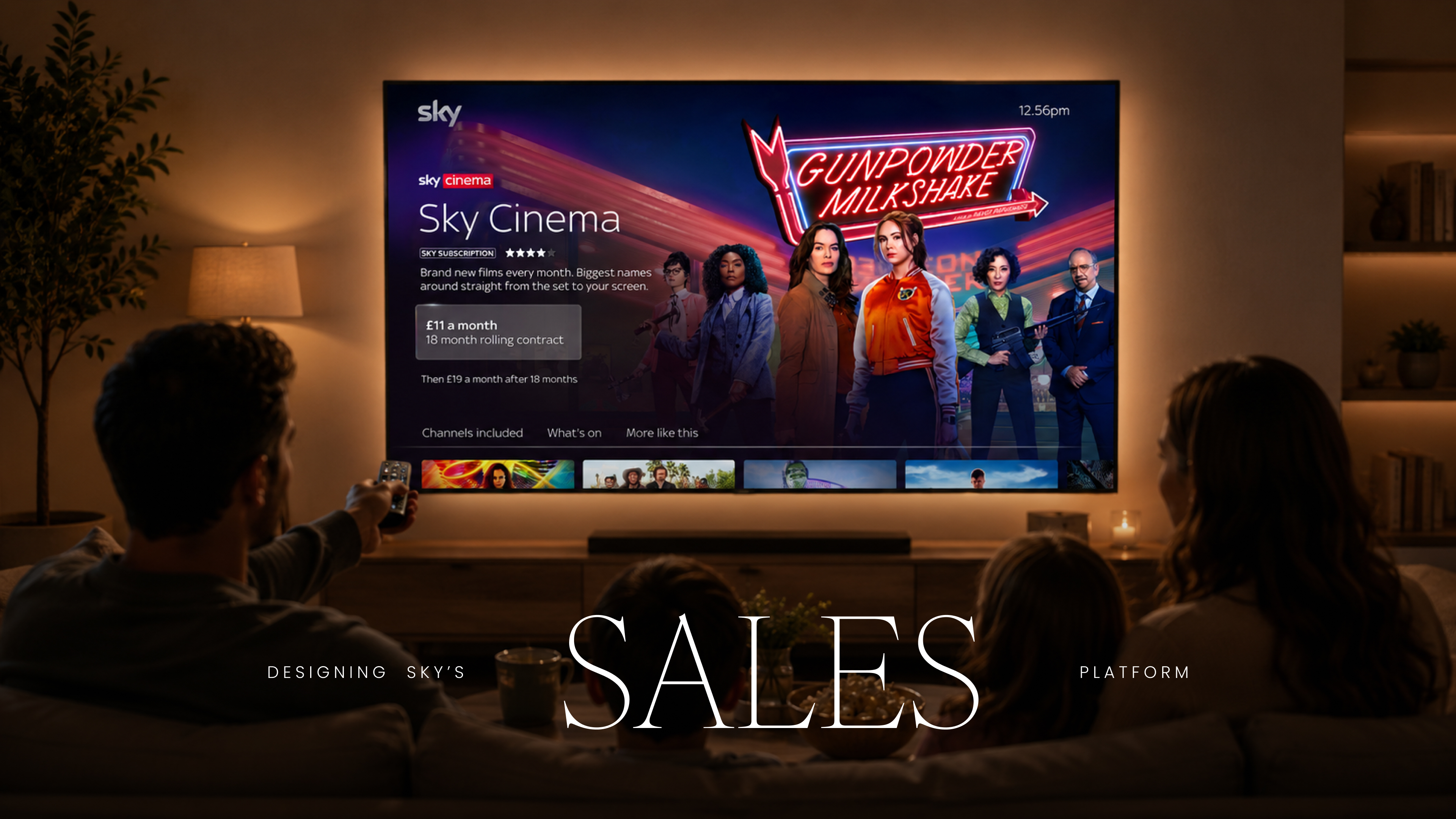
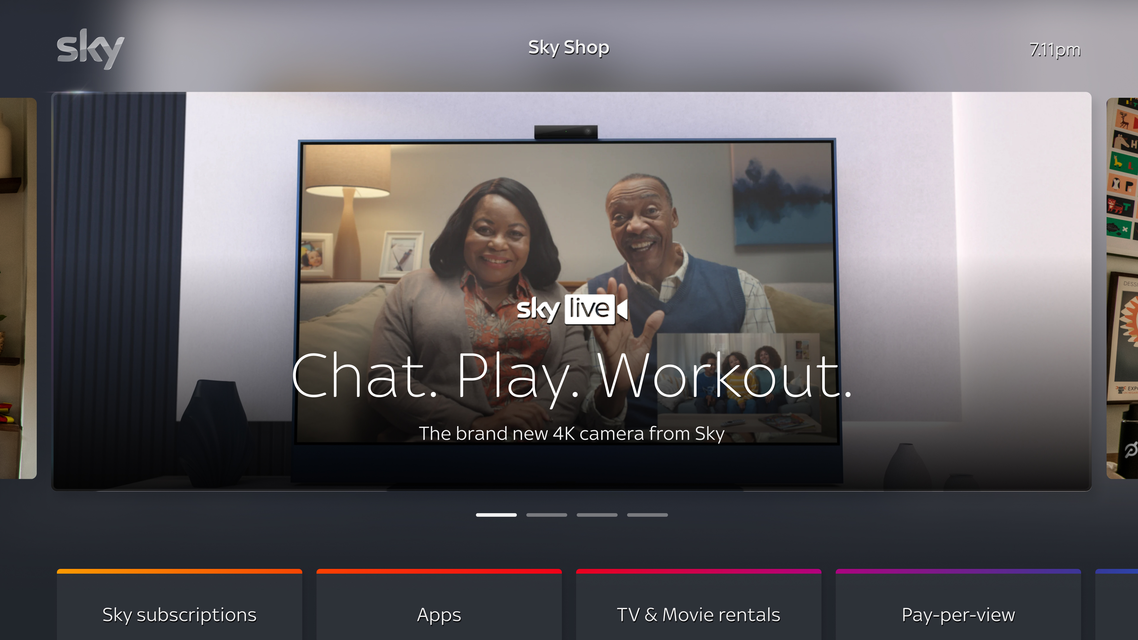
A marketplace as cinematic as the content beside it. Subscriptions, partners, tiers and hardware drawn into the same atmospheric language as the films and series the household had come to watch. Browsing what to buy began to feel like browsing what to watch.
The TV was where Sky's customers spent their time. It was also the most one-directional surface they had with the brand. Everything else, adding a sports pack, switching a tier, picking up a partner subscription, buying hardware, happened on a different Sky surface. A call centre with a long wait. Sky.com, opened on a laptop in the kitchen.
The brief was to change the shape of the relationship.
Make Sky the ultimate content aggregator. Position Sky as the platform, not just the space where Sky content lives. Bring every subscription, every partner, every tier, and every piece of hardware into a marketplace that lived directly on the TV.
The Sky Store as it existed was a small place for paying for movies on demand. We were asked to turn it into something else. The entry point. The doorway. The first place a household went when they wanted more.
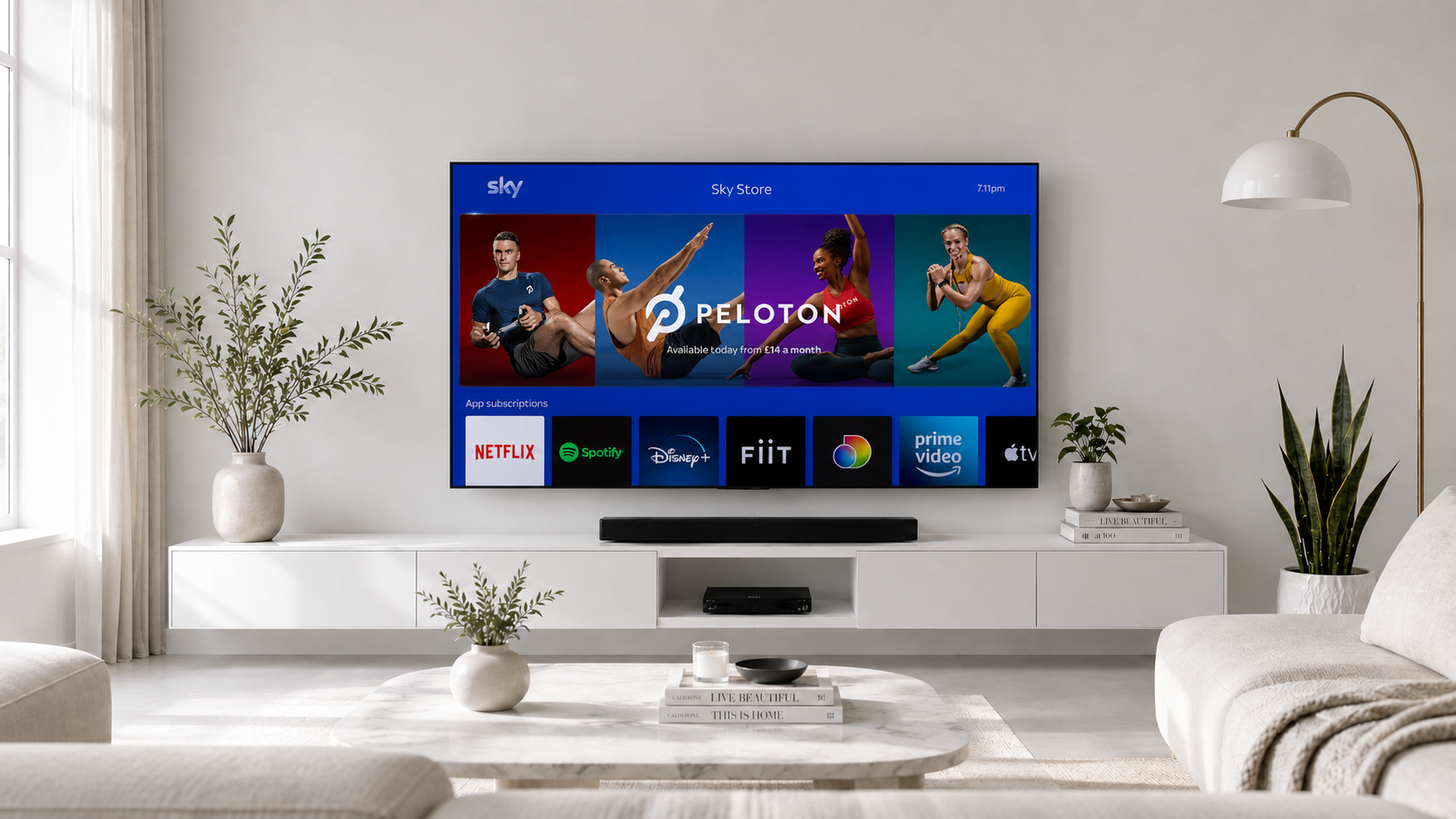
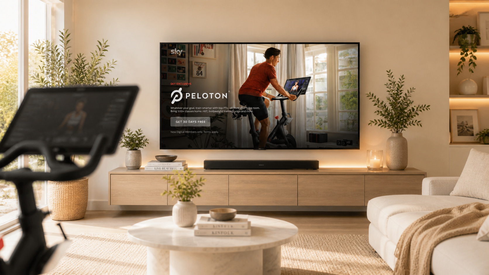
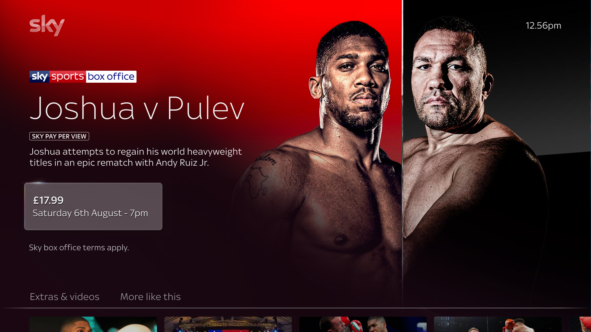
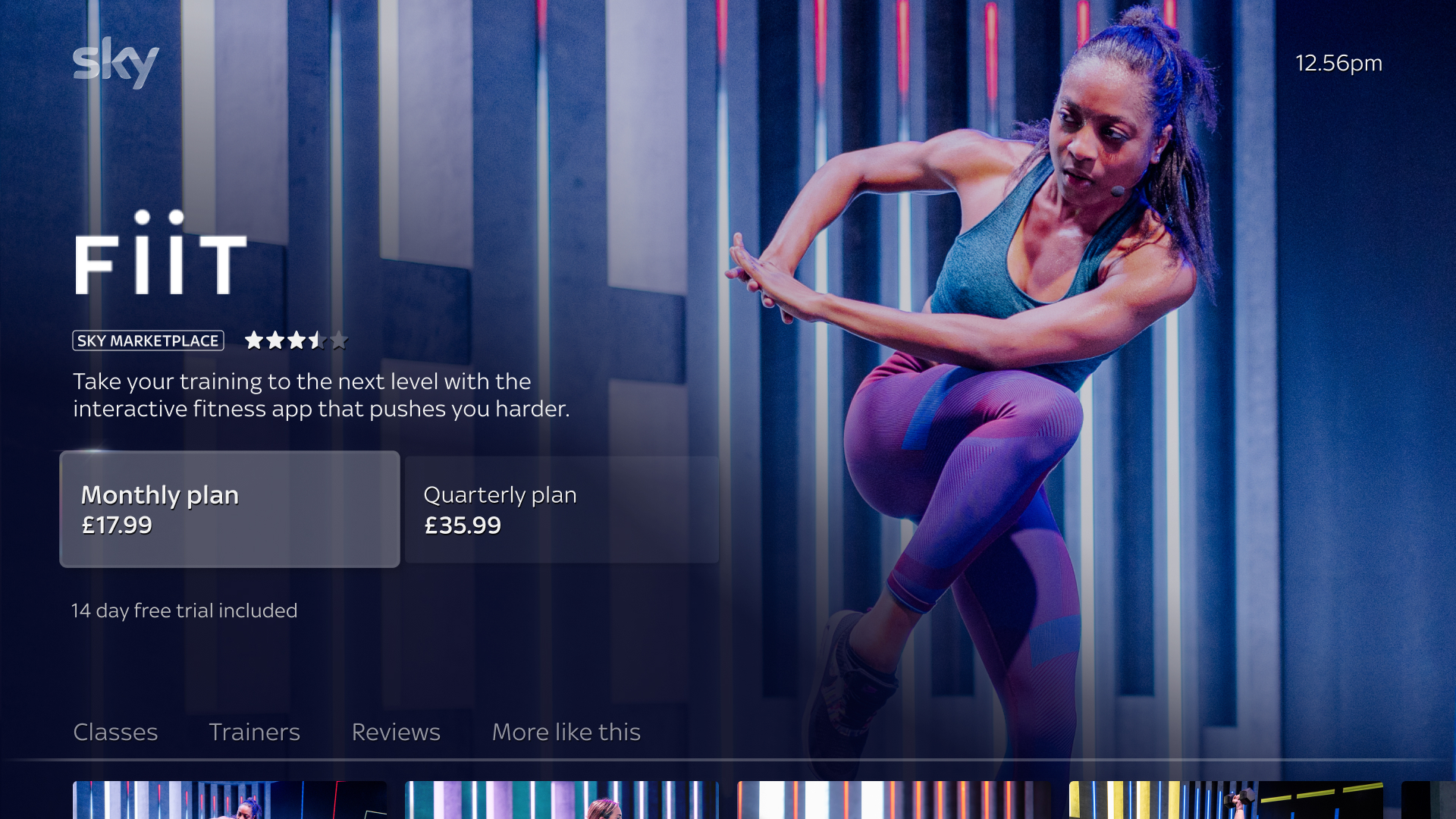
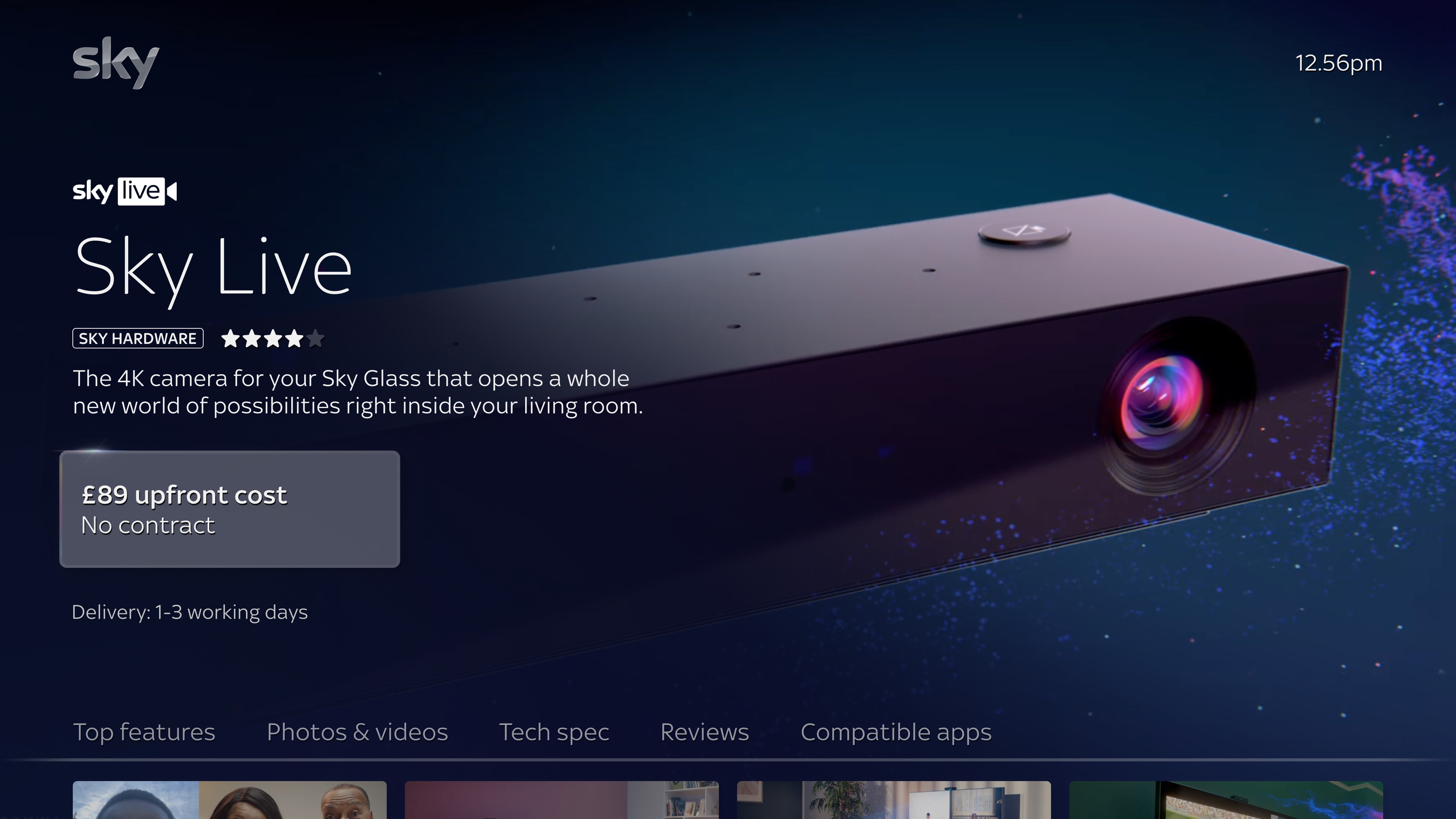
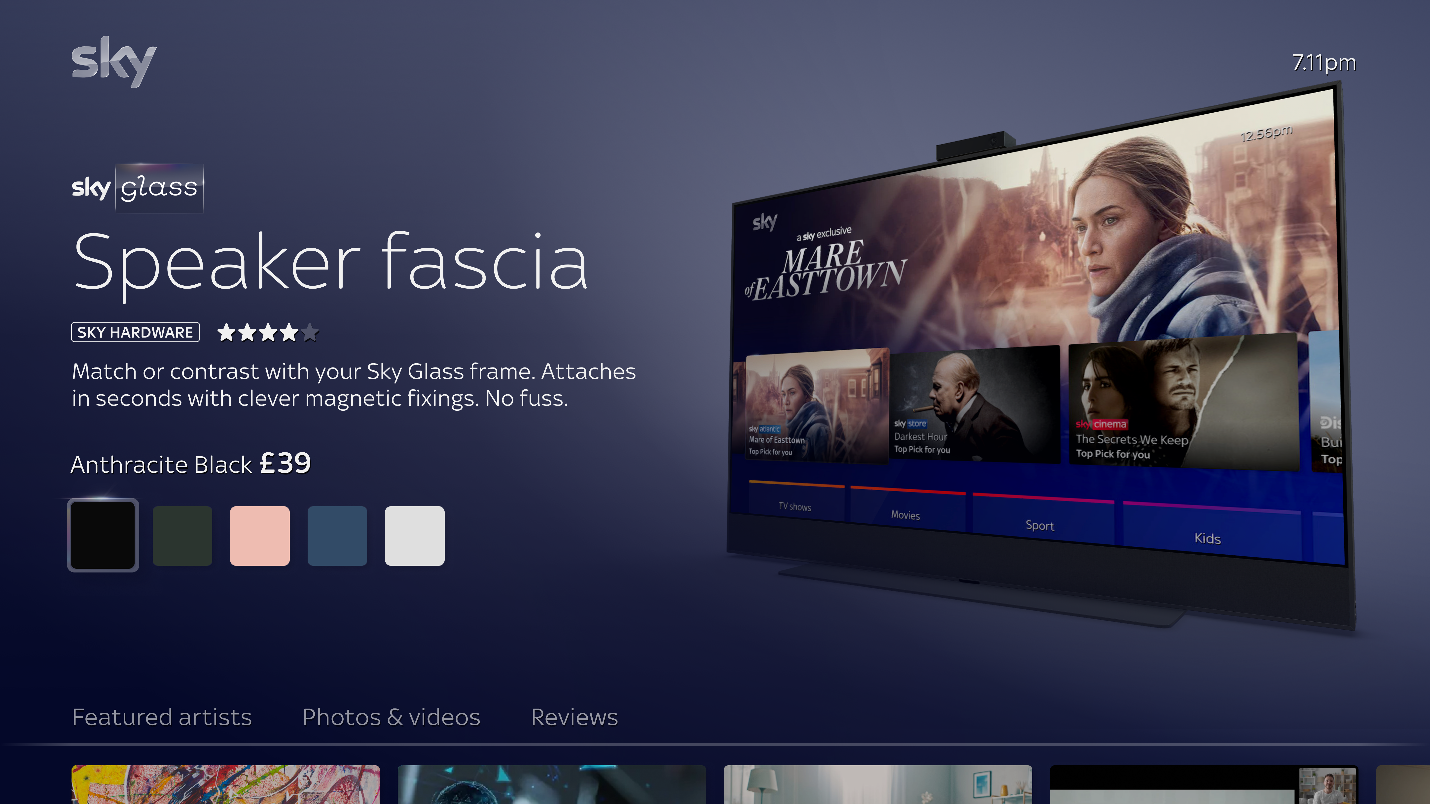
The marketplace had to hold things Sky had never sold before. Fitness with Peloton. Music. News. Hardware. International streaming partners. Each one needed to feel like itself, not like a row in a database.
The same design language carried fitness alongside cinema alongside hardware. The viewer felt the breadth without ever feeling the system underneath it.
Help, utility and service journeys at Sky had lived separate from where people were watching. The website. The phone. The call centre. Each one a different door, on a different device.
The instinct in a project like this is to migrate all of it onto the TV. We resisted that. Meeting users where they are is not the same as bringing every service into one place. A TV is a sofa medium. Some journeys belong on it. Others do not.
Let the journey meet the device.
Marketplace belonged on the TV. Buying a subscription is part of the watching experience. The faster a household can find the content they want and unlock it, the better the service feels.
The original Sky Store had felt like a checkout. The new Marketplace had to feel like the rest of Sky. Subscriptions had to read as things the household wanted, not as things they were being sold. The visual language was the work.
The journeys that did not belong on the TV got a different treatment. Managing payments, updating bills, navigating account complexity. Not sofa moments. The TV held the user's hand and passed them gently to the device that fit the job. A continuity of journey, not a continuity of device.
The household was already there. The screen was already on. Buying was no longer a separate step out of the experience. It became part of the experience itself, sized for a sofa and a remote rather than a desk and a mouse.
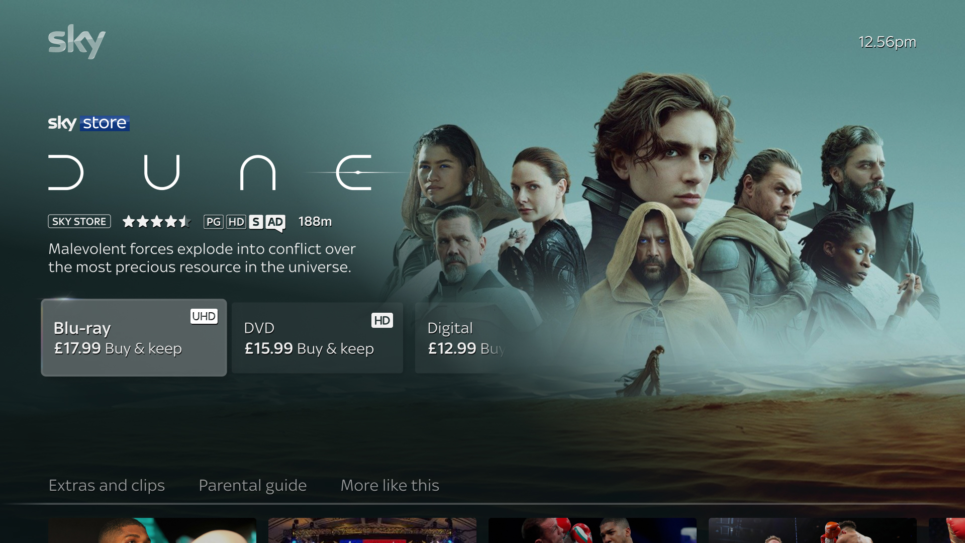
The work that did not show was the largest part of the project. A robust design system capable of holding a single paid product alongside multiple-tier subscriptions, hardware bundles, and partner products with their own commercial logic. Pricing flexibility that ran from a one-off rental all the way through to a recurring three-tier subscription with hardware folded in. Subscription tiering, marketing copy, billing rules, all sitting inside the same product surface.
We built the system to handle the breadth without losing the calm. Sky Cinema sat alongside Peloton, sat alongside Sports, sat alongside Entertainment. The same language held every one of them in place. Every customer journey, from discovery through to billing, had to make the household feel they were in safe hands.
The same design system carried wildly different product types. Pay-per-view rentals alongside fitness subscriptions alongside premium hardware alongside speakers alongside the homepage that pulled them all together. Each one was authored with its own commercial logic, and each one read as itself within the same shared language.
The TV became Sky's second channel for revenue, after the call centres.
It was not a small move. Customers had a deeply held mental model that the best deals lived behind a phone call, and the call centres were not going anywhere. But by opening a pathway directly where the customer was already sitting, the funnel widened in a way the company had not had before. Sales generated through the new Marketplace started to compound. The platform paid for the design of itself many times over.
The work taught me what good design at the commercial edge of a business actually does. It makes the moment of purchase feel like part of the experience, not a step out of it. The customer ends up in a place they wanted to be. The company ends up with a channel that earns its keep. The two are not in opposition when the design is doing its job.
The lesson from the marketplace was that commerce in the right context does not feel like commerce. The customer ends up in a place they wanted to be. The company ends up with a channel that earns its keep.
Wellness, especially direct-to-consumer wellness, has a long history of getting this wrong. Products that feel like a sales funnel pretending to care.
I am interested in the version where the design is honest enough that the household feels held, the company finds its margin, and neither needs the other to fail.
That is the work I am bringing forward.
Curious how this could apply to your business or project?