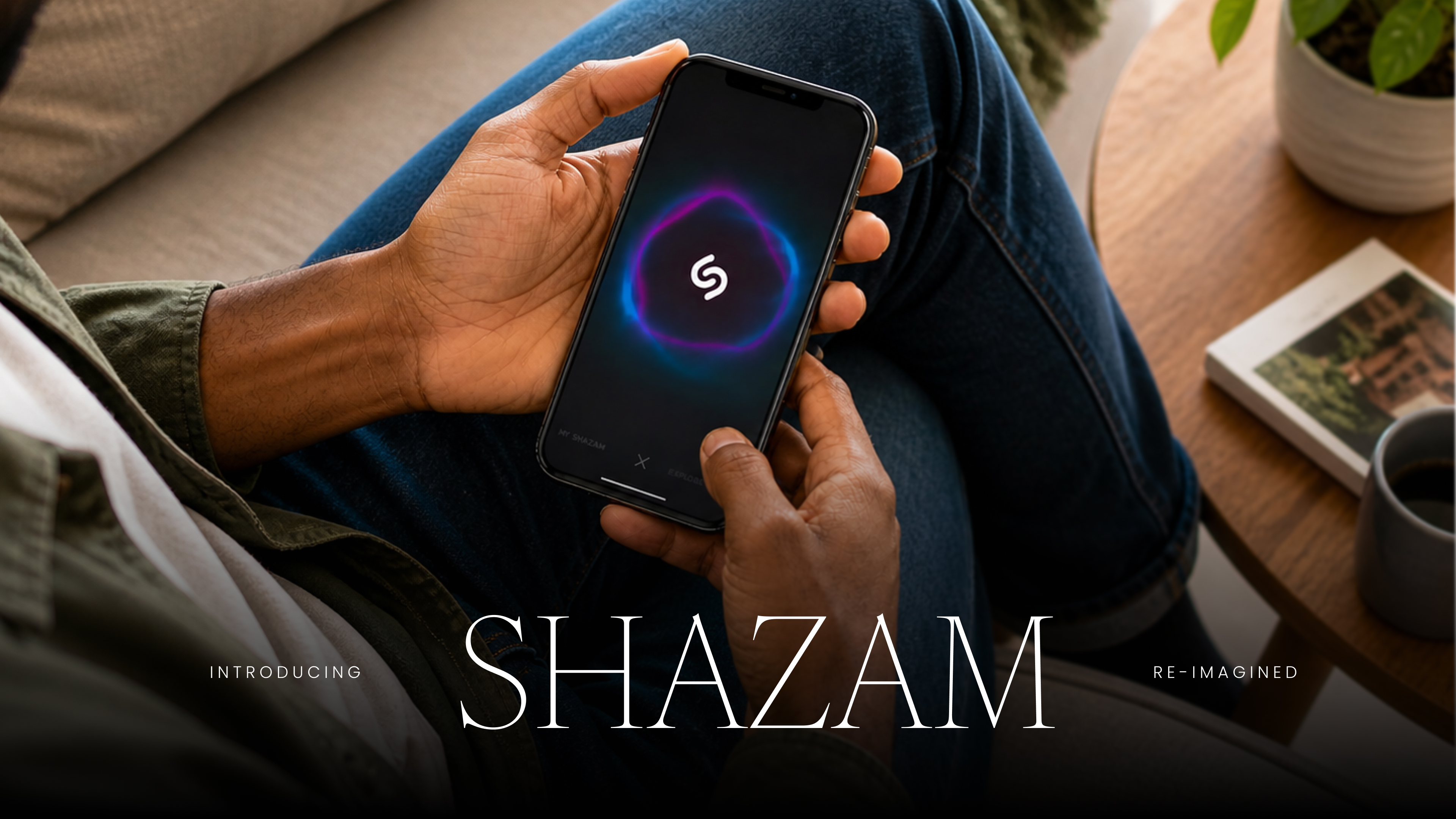
Refreshing the brand, enhancing discovery, and reimagining what Shazam could be. From a utility for two hundred and fifty million people, into a destination experience built across the entire ecosystem.
In 2013, Shazam was a utility. You held it up, it heard a song, it told you the name. It was brilliant at one thing and almost nothing else. The product had two hundred and fifty million users.
The brief came in two parts. Refresh the brand and enhance the experience, while it was in active daily use by all of those people. And expand what the product could do for them once the song had been recognised.
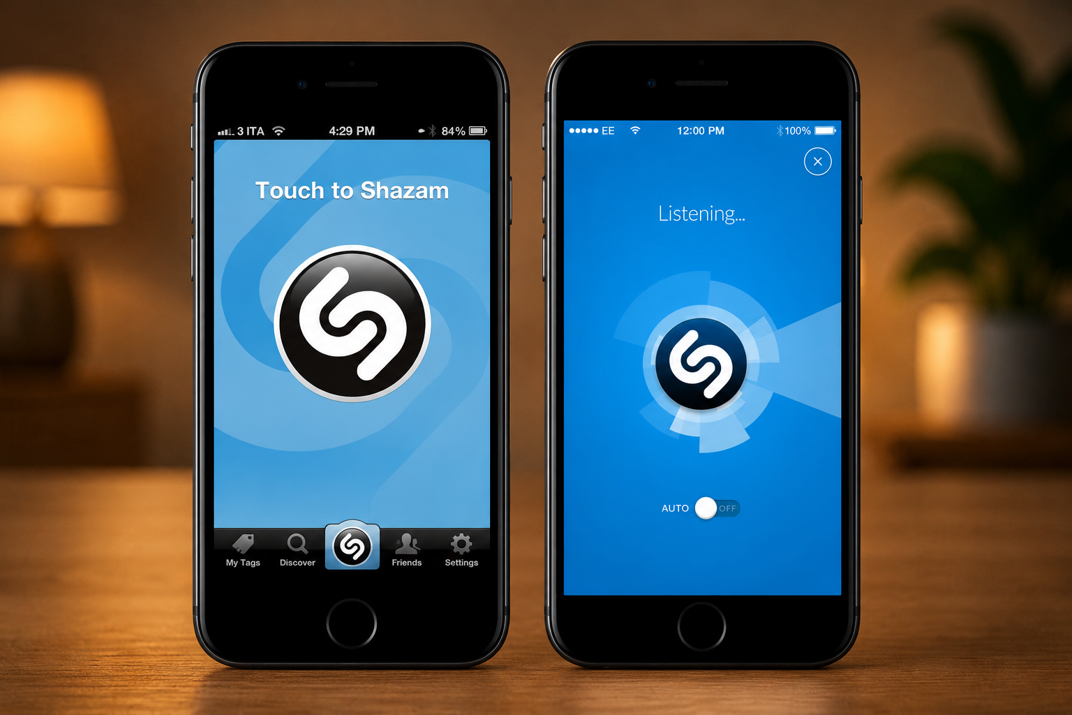
We rebuilt the foundations of the existing app underneath the user, while they were still inside it. The recognition flow stayed exactly where it was. Around it, everything got cleaner, calmer, faster. The brand moved from legacy patterns into a coherent, modern visual language that felt at home on the new generation of phones.
That phase of work alone lifted the app from two stars to five.
We did not stop at the surface. The minute after recognition, the most charged minute the user spent with the song, was where the existing product used to go quiet. We rebuilt that minute as the start of something, not the end of a question.
The new discovery flow gave the user more to do, and more to learn, the moment a song was identified. They could read about the artist. Watch the official video. See the lyrics scroll in real time alongside the song. Choose which streaming service to listen on. Add the song straight to a playlist, or save it to favourites for later.
Music discovery became seamless. Shazam stopped being a scanner that closed the second its job was done.
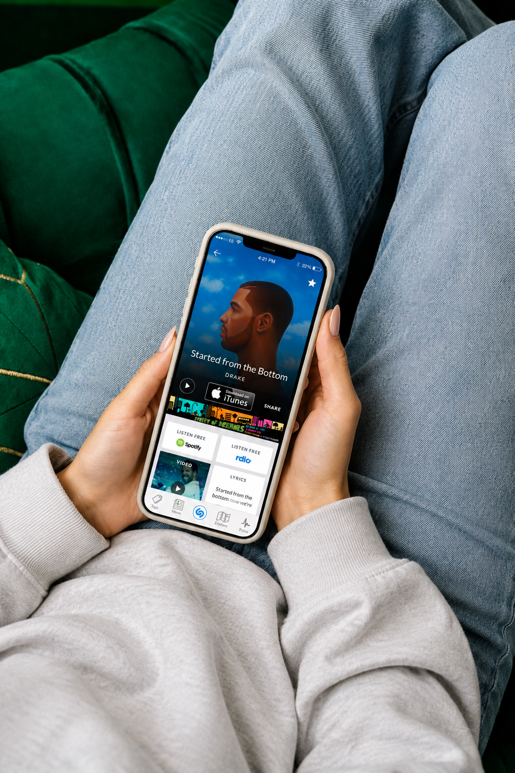
The discovery screen became the centre of gravity for the whole experience. Every action a user could take next, listen, save, share, dig deeper, sat one tap away from the song they had just identified. The product began to feel like a place, not a transaction.
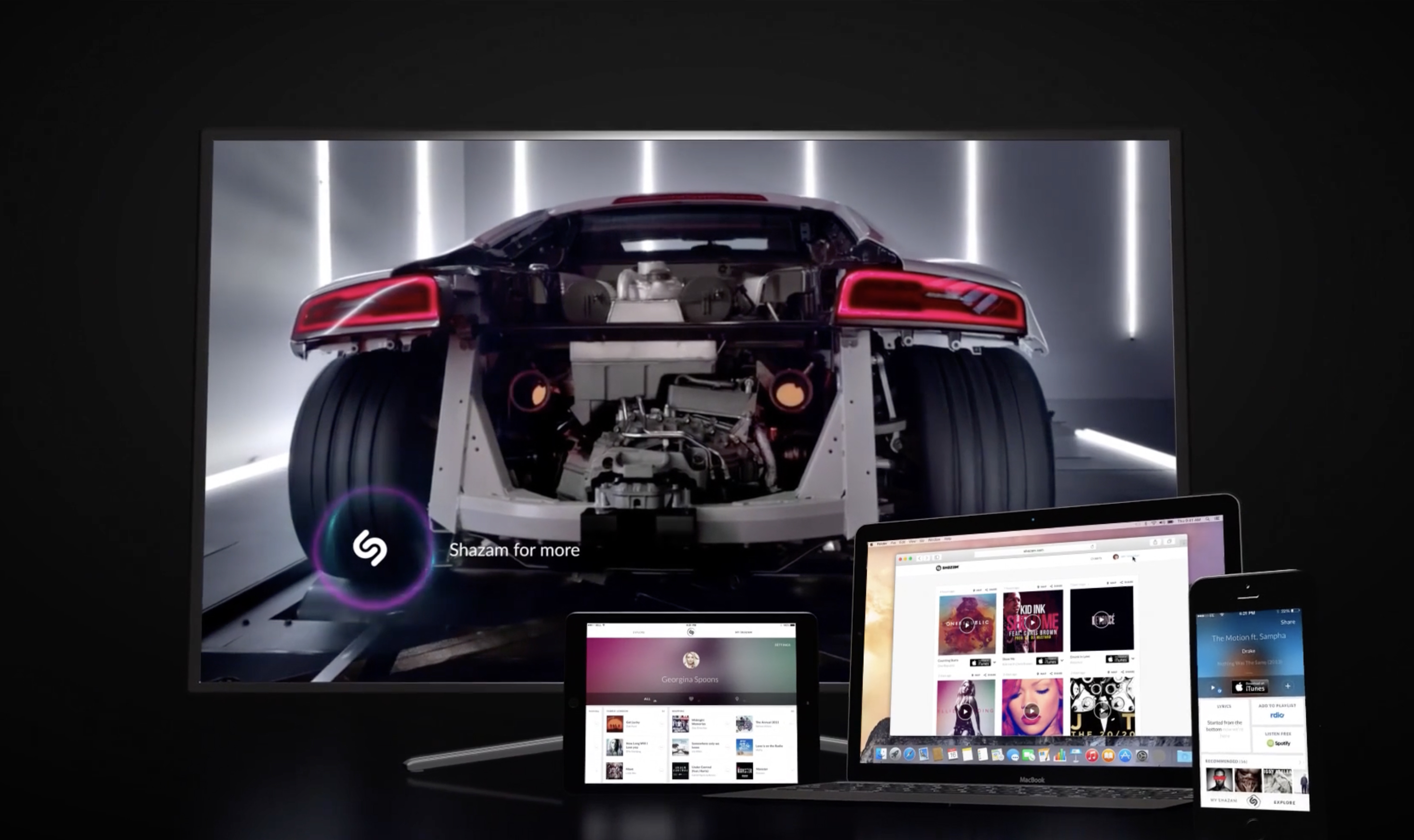
We extended the new language across the entire Shazam ecosystem. Mobile across platforms, tablet, web, and television. Each form factor amplified a different part of the design. Mobile sharpened the listening screen. Tablet held the artwork environment. Web carried the cataloguing.
Television opened the door to something the product had not done before. Shazam on the TV recognised the music underneath adverts, films and TV shows, taking the famous recognition feature into territory that went beyond music alone. A song you heard inside a trailer pulled up the artist, the soundtrack, the show, the streaming service it lived on, and everything else worth watching alongside it. Discovery, expanded.
With the refresh live and the ecosystem extended, Shazam came back with a bigger ask. They wanted us to explore what the product could become if it was reimagined from the inside, not just refreshed on the surface.
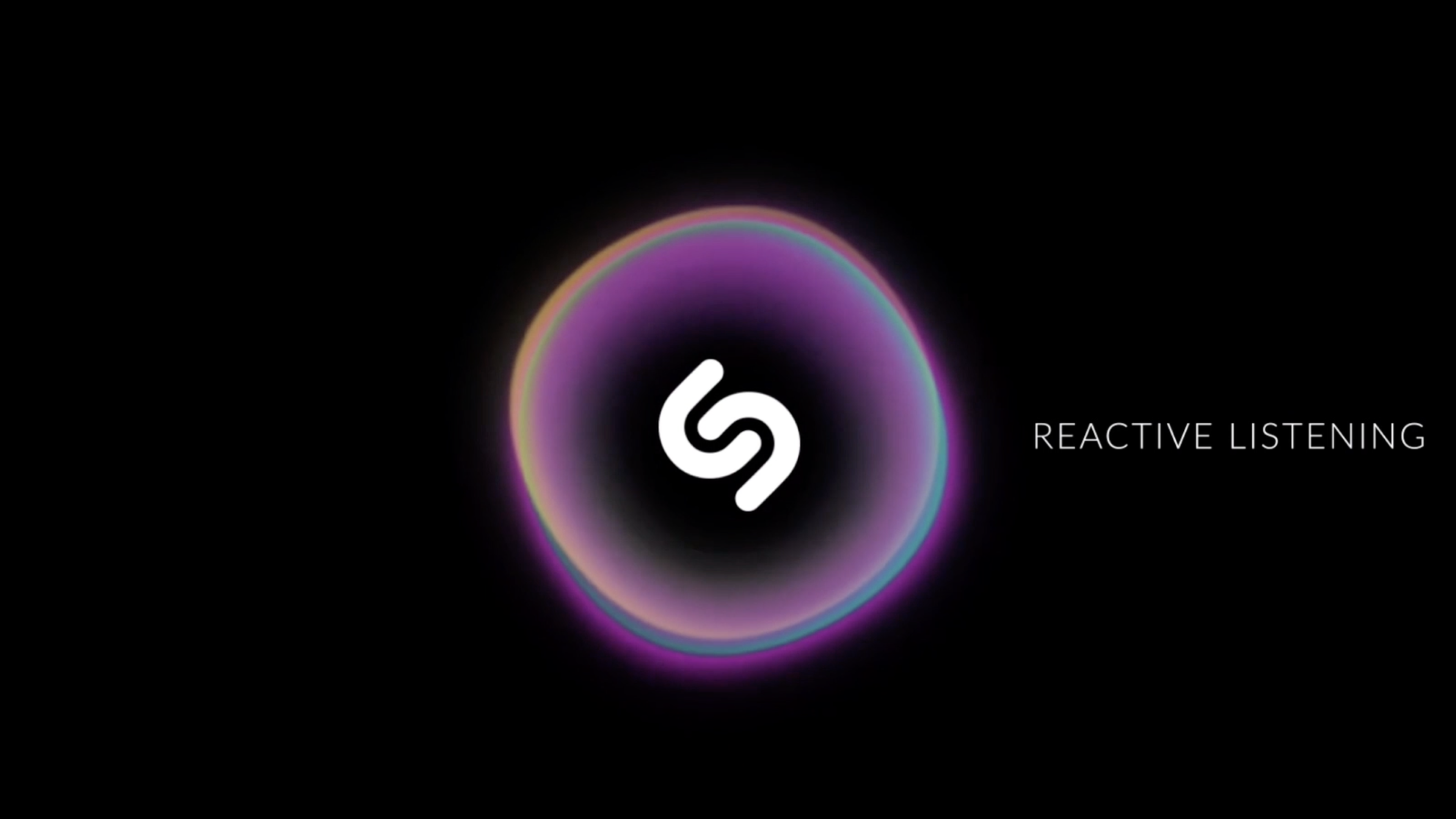
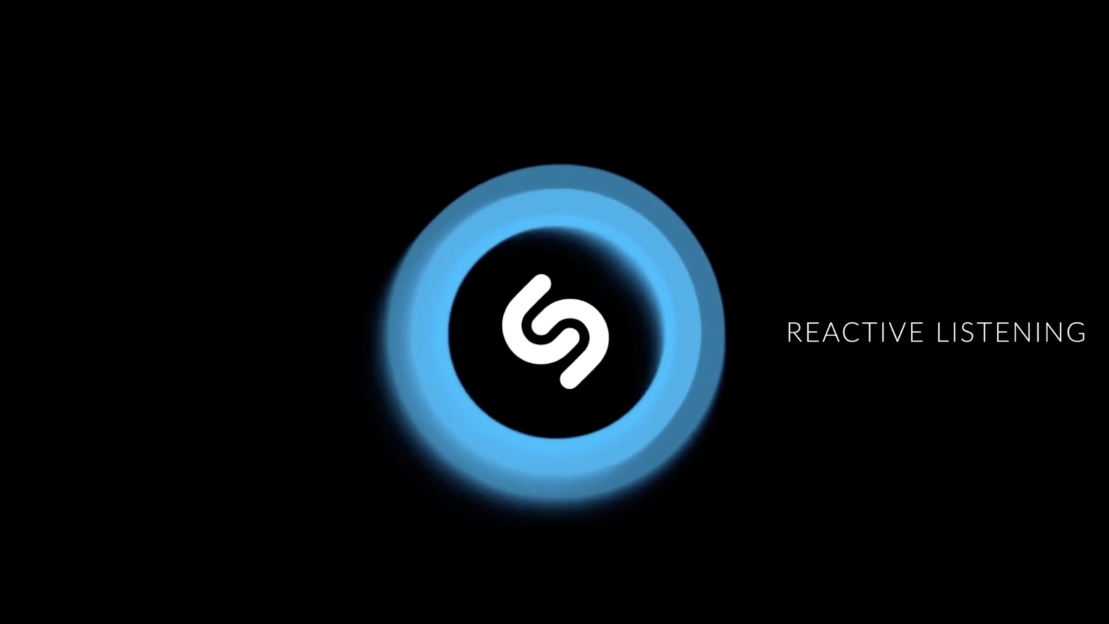
That is when we built the reactive, emotive listening screen.
The listening screen, the few seconds when a person held their phone up to the world and the world identified itself back, became adaptive. It read the genre of the song. It read the emotional intent the artist had encoded. It evoked the feeling the music carried. Colour, motion, depth, and rhythm all shifted to match.
A late-night ballad opened the screen in slow blue. A festival anthem broke into hot motion. A field recording stilled it.
Recognition still happened in seconds. The seconds after recognition now read like part of the song, not the receipt for it.
The refresh and the new discovery flow shipped to users. The two-star to five-star lift happened on the live app. Existing functionality and the transactions that paid for the company were not compromised. They grew. The product reached every screen in the ecosystem.
The reactive listening screen was a different kind of brief. It was never intended for general release. It was built to show Shazam what the product could become if it were re-imagined, and to take that vision out into the world. We brought it to CES and to Mobile World Congress, the two stages where the music and consumer technology industries tell themselves what the next year looks like.
The reception was loud. The community wanted what they had seen. The press picked it up. The conversations it started about adaptive, emotive interfaces in music recognition continued for years.
The brief that asks what something could become, not what it currently is, is the brief I am still most drawn to. It is the brief that takes the longest to argue for, and the one that pays the most when it lands.
The lesson from Shazam was that a transactional product becomes meaningful when its core moment is designed to evoke a specific emotion. The recognition screen taught me that the most charged seconds with a user are an opportunity, not a courtesy.
Most wellness products treat their charged seconds as a chore. The survey. The onboarding form. The daily check-in. Designed differently, those become the moments that make a product worth coming back to.
The craft of designing for emotion at the moment that matters is the craft I am bringing into wellness now.
That is the work I am most interested in carrying next.
Curious how this could apply to your business or project?